Detected
No clear hierarchy
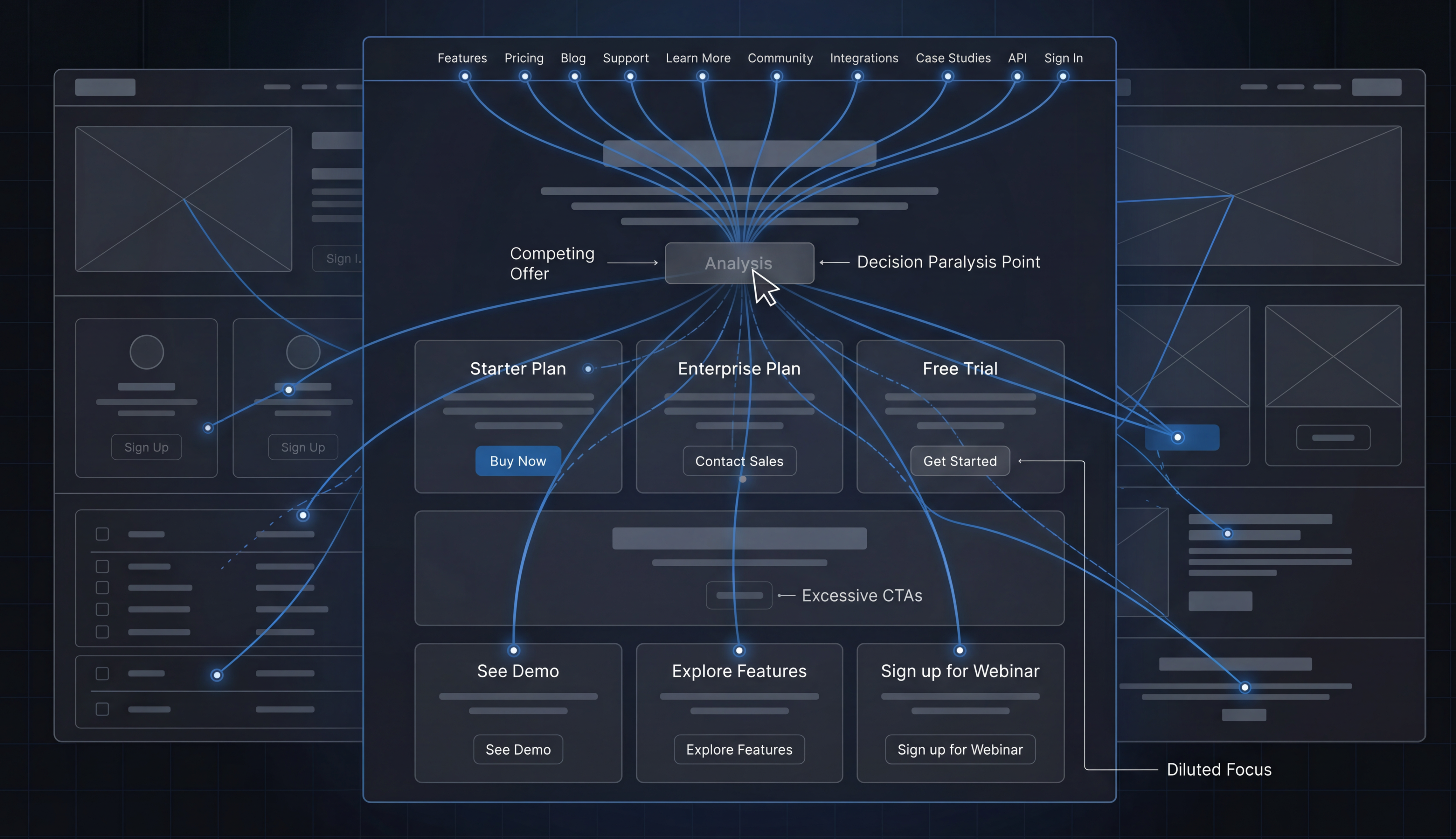
When everything competes for attention, visitors lose the path.
Visitors rarely tell you when a page feels confusing. They just leave.
Detected
When everything competes for attention, visitors lose the path.
Detected
Crowded navigation and scattered actions create hesitation.
Detected
If the next step is unclear, users are more likely to leave.
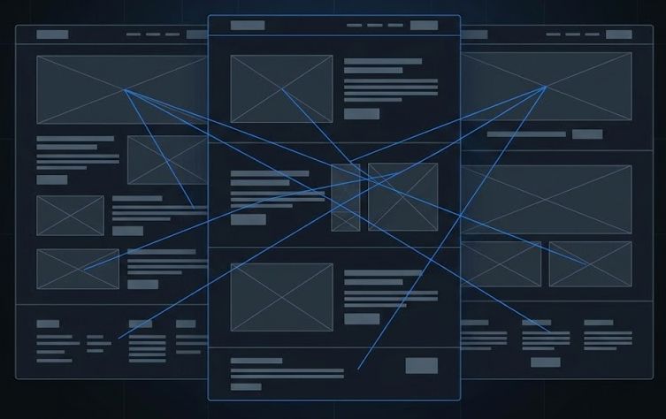
GoWeb reads the rendered page — structure, hierarchy, responsiveness, and interaction signals — the same layer your visitors actually see.
H1 structure
Checks whether the page presents one clear hierarchy anchor.
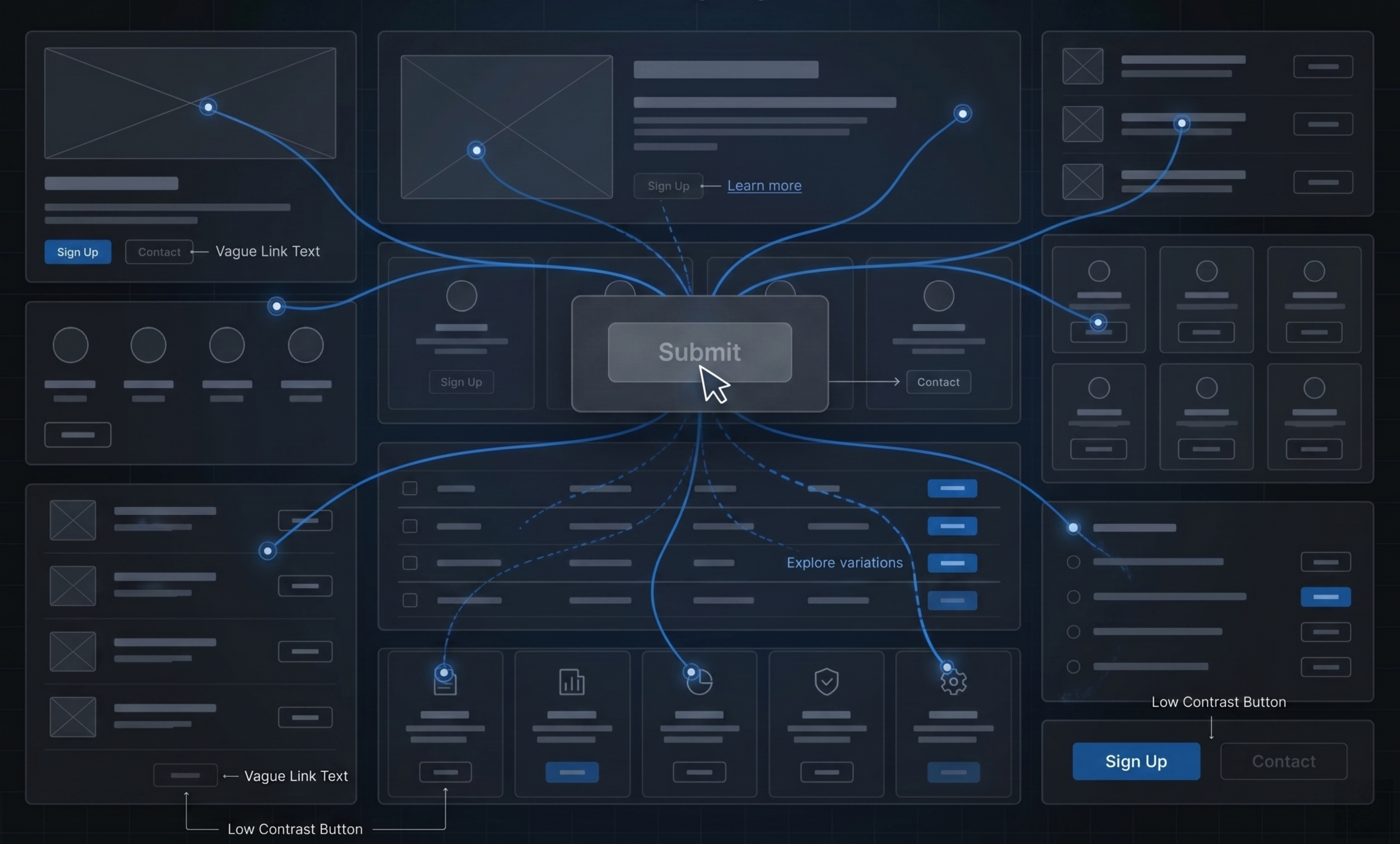
CTA clarity
Reads whether the next action is visible, specific, and placed with intent.
Mobile overflow
Looks for rendered elements escaping the viewport or breaking rhythm.
Navigation complexity
Measures how much choice and friction the header asks visitors to carry.
GoWeb turns rendered frontend behavior into clear, actionable audit signals.
A page can look polished and still create hesitation, confusion, or friction.
Every scan turns invisible friction into measurable signals.
Websites analyzed
01693
Issues detected
022,481
Average scan time
039.2s
Preview how GoWeb turns a rendered page into scores, findings, and clear issues.
Demo report
Score
82
Demo report
Score
74
Demo report
Score
88
Start inspection
One URL. One scan. A clearer view of what your visitors actually experience.
No signup required
Websites you can try
Start with any public page you already know.